Thursday, January 27, 2011


             This week we discussed the art style of Fibers, which really took me by surprise how innovative and unique the art is.  Before the lecture I only thought of fibers as producing fabrics and sewing quilts.  At the beginning when Professor Sarah was talking I was able to grasp the idea of what Fibers art is and understand how this type of art is so famous.  I thought her presentation was very intriguing because I never really took attention to this kind of art before.  For example in the first few slides of the presentation I was amazed about how something so tiny can produce these huge sculptures.  It made me think about how fiber art is almost like the art of human life.  What I’m trying to say is that all these piece of fiber are being put together to create this innovative and interesting art pieces.  Just like how societies should strive to be, coming together to be a strong and happy community.  Next she showed the art pieces of Claire Zeisler, and I thought she was genius.  Her use of fibers made me also think about how great our society is when people work together.  In the piece where it has these long pieces of bounded threads twisted carefully hanging from the ceiling and being untwined on the bottom.  
Claire Zeisler's piece.
At first glance it gave off like a samurai, Japanese royalty feel because of the bright red threads and use of wavy lines.  But, more importantly I saw it also symbolizing a happy life.  I interpreted it, as when people come together it’s strong and can be something big, but when separated the binds come lose and it's a big chaos.  Just like the piece, everything is so neat and precise where the threads are together, but at the end they all just come apart.  From then one I viewed fiber art as an art form that can project a stronger message because of its limitless possibilities.  Fiber art can be all kinds of dimensions giving it the opportunity to not only mentally, but also physically send a message across.  For example, Cat Mazzas Nike blanket, I found that piece not only visually appealing but also the message behind it made it even stronger.  It was able to not only project the message visually, but when you look closer there is another story told in each of those 4-inch patches.  It’s intriguing to me the depth of fiber art.  It doesn’t stop at the surface, you figure out the meaning the more you into it and the smaller details.
            My personal favorite, was Cat Mazzas, besides her Nike blanket (PICTURE), 


her other knit pieces are phenomenal.  I just found how she incorporated the skills and techniques of knitting into digital art.  I find that a very creative and innovative combination that nobody would expect.  In her animation she uses a lot of details that look like stitching.  I find that very fresh and new that it puts a whole other side to what fiber art can be.  The piece entitled Kintoscope Testimonies, where she interviewed people working within the labor union, but there faces were consisted of only these small x’s that resembled a (PICTURES) stitch.  


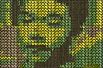
Not only was it amazing how they were able to use only these x’s to create recognizable human faces.  But, I was also amazed as how eye catching and urban it looked.  Taking this very old-fashioned feel of knitting and reinventing it to give of a modern, hip look.  She really redefined what fiber art is and can be.
            Besides the presentation we also looked at two more artists, Ann Hamilton and Cai Guo-Qiang.  I really enjoyed Cai Guo-Qiang’s work not only because it was eye-catching but also the messages he was able to portray visually.  He took installation and fiber art to whole other level.  When looking at his work it took me awhile to figure out how his art is related to fibers.  Then it hit me, fibers don’t always have to be thread or clothe.  Fiber art is taking any physical thing and putting them together in a way to create an art piece.   It could be gunpowder like Qiang does in his drawings or even everyday supplies that were put together to make a huge airplane.  His work really made me understand what fiber art has to offer.  Like what Sarah said, these pieces are made to explore personal stories.  Which makes sense to why they are so successful, these textiles are able to touch someone emotionally at a global perspective.  The message is not as clear as iconography, but the more you engage into the more it starts to make sense and wow min

Wednesday, January 19, 2011

This weeks focus on iconography really caught my interest because its one of my biggest influences when it comes to doing art.  Professor Michael Salter’s presentation caught my attention from the very beginning.  His opening slide with just his name and iconic character was very intriguing to me.  Just the color contrast and flatness of the slide was really eye catching.  In the beginning when he was talking about his life before becoming a professor he mentioned about how he was “overly observant.”  I found this interesting because it made me realize that its ok to question every little thing and wonder how something is made, why it looks that way, what does it stand for.  Every little detail matters and maybe that one image can trigger a great idea.  Another thing he mentioned was to “surround yourself with stuff you love.”  By looking at his work I was able to tell without knowing, he’s into street art, the surfing lifestyle, urban lifestyle, and simple ideas.  And come to find out he’s a surfer and is the only professor wearing the sickest pair of Adidas kicks instead of loafers.  It inspired me to do art not only to please others but also to please my self and do pieces that I feel happy about.  An artist’s surroundings become their greatest inspirations and motivations to produce great work.
Seeing Professor Michael's work I thought of these pair of shoes by Jeremy Scott for Adidas because it plays off of the common wish of being able to fly.  Just like many of Professor Michael's pieces he takes ideas people think about and presents it visually.  Also i thought of this because he mentioned he's into kicks and was wearing a tight pair of kicks during the lecture
In the latter part of his presentation when he began showing his work I was literally going crazy.  His style of art is what I live for and admire.  It is flat, high color contrasts, street/urban feel, playful, fun, and clean.  His work made a statement and showed images that are only thought about.  He takes funny jokes and thoughts and makes them a visual piece.  I also love his work because it never gets old.  For some reason I could look at his work everyday till the day I die and still admire it.  My favorite image was the boy with the extremely large Popsicle in his mouth.  I like this image the best because it had so much emotion and questions to ask that I couldn’t stop looking at it.  It had this combination of Asian pop culture mixed with the clothing style of Billionaire Boys Club.  I was amazed on something so simple can convey so much thought and emotions, that it got me thinking he could put any type of food in the mouth and it would be a whole different piece.
This is the logo for Billionaire Boys Club, a popular urban streetwear brand.  Viewing Michael Salter's work made me think of their logo and style of clothes they produce.
Another artist studied this week was Chris Coleman.  His work really spoke to me because of the issues he tackles through his art.  For example sculpture entitled “Informational Divides” took on the complicated and current issue of race.  Nobody really pays attention to race and how it sets divisions in our society.  I really like how he layered the piece by having the people first and then going to the emotions, land, and ending with government.  It told the story perfectly, shows what’s happening physically, then the emotions felt, how it affects are land, and where the problem all started.  This piece is not only visually intriguing but content wise as well.  His style also has this simple yet detailed look to it that makes it even easier to look at.

While watching his work I somehow thought about an artist that goes by the name of Buff Monster.  Somehow the flat style and usage of color made me think of this artist.  Buff Monster uses a lot of iconography in his works and is really famous for it.  He uses strong outlines with solid colors that contrast with each other, and creates unique characters that capture the eye.  Take a look at video taken at one of his shows.

Both these artists have one thing in common; they use iconography in some way or another in their art.  This weeks reading was all about iconography, how its developed and why it’s so popular in pop culture.  In the beginning I thought it was really cool how it showed the stages leading to an image becoming an iconographic piece.  I was really able to grasp what a true iconographic image is.  I learned that it’s about capturing the important points of an object and flaunting those to capture the essence of it.  This article made a point as well, our society lives of iconography.  Whether its business logos, bathroom signs, street signs, personal messages, and even languages are all icons.  The big part of this reading was about how iconography shapes the comic world.  Before reading this article I never thought of comics being iconographic images.  But now I realize that the reason why comics are so popular is because the art used is so generalized to the point where everyone can relate to the characters portrayed.  I also liked how he mentioned manga pushing the boundaries even farther when it comes to comic art.  Their characters are not only iconographic but started a culture, which proves that cartoons and iconography has a big part in the culture of our society.  Without it there would be no Mickey Mouse, Spiderman, Toy Story, or even the basic four stroke happy face.  Iconography has shaped our society and will continue too for many years to come.
After i finished my blog entry i went to my closet to find this shirt, and it kind of reminded me of everything we viewed and read about this week.  If i were to view each icon separately they each would have their own story and meaning no matter how simple it is.   Iconography is great because its so basic yet makes me think and look at it for much longer than a normal painting.

Thursday, January 13, 2011

WEEK ONE


            I thought that this week’s guest speaker, Laura Vandenburgh had a great message and point to her presentation on drawing.  Many people think of drawing as a pencil to paper kind of thing but she showed how drawing could be pushed to another level.  Drawing doesn’t have to be this realistic masterpiece but it can be as simple as a doodle on a test paper during class.  Even though all the slides shown were different pieces of art, they were still considered drawings.  I could really relate to what she was presenting because I think there is no definition to what is art.  If the artist considers their piece to be a drawing then that's their point of view and the viewer can either agree or disagree.  That's the great thing about art, it’s so broad that many point of views can be established and create fresh, eye opening, mind questioning pieces.  When you think about it, everything in the world is a piece of art.
            One of my favorite pieces from the slideshow Laura presented was where it was in a gallery and it showed two walls with simple black curved lines covering the entire wall.  I really liked this piece because of its simplicity and how the place of the lines created a sophisticated and expensive vibe.  It made me think, “I could have done that,” and I really love those kinds of art pieces because it proves that anything can be art.
            Another artist we studied this week was Margaret Kilgallen who was a famous for her hand painted masterpieces on big surfaces.  I really enjoyed her work because although she drew people and other physical objects, she made it her own.  When you see her paintings you know it was done by her because it had a certain look and characteristics that were special to her.  I really admire her for that because it’s really hard for an artist to develop his or her own style that can be recognized right off the back.  Another reason why I like this artist is because she is a street artist.  Street art is one of my biggest influences and inspirations because it has a sense of freshness I don’t get from other art.  Viewing her work it has a nostalgic and playful vibe that when I look at it, fond childhood memories come to mind.  Also her technique is very clean and precise which makes it look even more intriguing and eye-catching.  Lastly, I admired the use of color in all her of her pieces.  She chose colors that create this common vibe and if you were able to put all her pieces next to each other, although they may be different they are all similar in a sense.
            One of my favorite pieces from her was the painting she did at UCLA.  I really liked this piece because of how clean it looked and the inspiration behind it.  Viewing the piece gave a nostalgic feel and made me wish that all business signs were hand painted again.  It showed that not all the time is neon signs and high tech stuff is better than simple hand painted ones.  She has this way to make you appreciate the past in your life and use it to better yourself in present day.  That is how I felt while looking at her work.
            Both these artists relate to the reading this week because they were successful in pushing the boundaries of art.  The reading for this week basically gave examples of modern art and how it was established.  Personally I love modern art because it’s more open and accepting to what is art.  Before the modern art movement it was all about technique and realism, which I don't really care for.  When an artist can take something and interpret it visually in their own way is admirable.  I think that it’s ingenious when artist’s like Duchamp take a toilet and turn it into a piece of art.  Who cares if he didn’t physically make the toilet, he was able to view the toilet as a piece of art and share his idea to the public.   This reading also made me realize that if there is a meaning and point of view from the artist in his/her piece then it’s art.  It doesn't have to be a classic Renaissance masterpiece or a Michelangelo sculpture; art is so broad that almost everything in life is art.  Humans are a work of art, technology, food, fashion, math equations, and buildings are all considered art. 


This is a sculpture done by the artist Takashi Murakami.  The reason why I though of him through this week is because his work has a style that is easily recognizable and he takes objects in life and recreates them to make it his own.  Also his work has been shown in classic art exhibitions where his style wouldn't be viewed as art in the past, but now he is one of the most famous artists of our time.  His visions and creativity always are mind blowing to me and I can never stop staring at his work.